Popular Posts

Monday, 14 March 2011

Final Poster

I decided to go back to my first idea that I had, with the close up shot of my sculpture.

I made a few edits to the first draft.

- Although I had the writing "GF Smith paper" I felt like the poster needed more identity. I added the GF Smith logo into the top right so people could associate the logo with the poster.

- I changed the font of the '100 years' and also the colour to make it stand out from the background and go more with the colour scheme of the whole poster.

Although simple, I'm quite happy with how my poster turned out, the striking bold colours would definitely catch somebodies eye and make them look closer to realise what the poster is about.

Friday, 11 March 2011

More poster designing

This time I decided to cut out some letters to see what I could do with typography made out of paper instead of digital.

I didn't want everything to be cut out, so decided to just choose
one bit to make out of paper, Design Museum
Half colour?

Putting my final piece into the poster?

Using the cut out's instead?


After putting a few pictures together I took, and editing them, I made a second poster. I like the simplistic style of this one, using paper as the background I think works well, but to me, It seems a little boring and I don't know if I'm a big fan of the cut out letter anymore. Back to the drawing board...


Wednesday, 9 March 2011

Origami Letters?

Had a go at making letters without cutting using the art of origami.

They turned out okay, I guess, but I don't like them enough to be on a poster, plus I wouldn't really know what to do with them, but it's an idea...

Poster Designing

I was getting pretty annoyed and losing patience rapidly folding up pieces of card, so I took pictures of what I already had and decided to take a break from folding and look into what I could do for the poster to advertise 'GF Smith Paper'

After briefly looking at the site, and some examples of the posters they have in their gallery, It was obvious that they go for the approach of 'Less is more', many of the designs and also the website itself is very simplistic, but quite bold.

My first thoughts when I knew we were going to produce a poster was to make the typography out of paper in someway, either just cutting out letters or maybe using shadows.

I tend to usually work best, by playing around in photoshop with an image and seeing what happens by chance. So I grabbed a photo and started to manipulate and add type to see what ideas I could come up with and what I could then do to any designs I like to include more hand made type or something...


As soon as I went on the GF Smith website, I saw a very Helvetica-like font, and me loving Helvetica knew I had to use it in my poster design. Whatever the final outcome is, I want it to be simple and clean, and I feel if I use hand made type, that It might not look as tidy as I want it to be. But I guess I'll just have to experiment and see what happens. 

Tuesday, 8 March 2011

Final Idea

After getting so annoyed and ripping so many pieces of card, I was finally getting somewhere

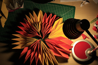
I had decided on making a flower using pleated petals I had made, out of orange and yellow card. I'm still not sure how I'm going to hang it up yet, or how it's even going to stick together really, but, I'm going to see how it goes

I made a few more petals and then stapled one side of them to make sure they stayed in place. It was now time to assemble the flower together. I bought some glue dots to stick the pieces of card together, I thought it would be easier to do and stronger than a glue stick.

I stuck them all together, at the top and bottom in a circular formation to create my final paper sculpture.


I added my little triangles I had previously made to the inside to see what it
looked like, I quite like it, don't know if it fits though? Hmm..


Folding Technique For Final Piece

So, I finally came across something I like the look of, I first saw a similar technique in one of Richards pictures I found on the internet.

If only mine could look that good..


What I liked about this technique so much, is that it was all to do with folding, and how one sheet of paper can have so many folds and take many different shapes. 

The whole design of this style of pleating, is based on triangles, you make triangles on the page and then fold them in on themselves, or out, and although it sounds pretty easy. I had a fair bit of trouble the first few times...


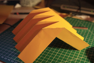
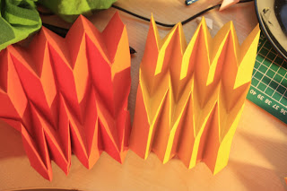
This was my first attempt, with just 1 fold, down the middle, simple enough really, kinda looks like a bridge the other way.


Bridge like?
The hard part was trying to keep that, while have 2 more folds to put into the mix, the first one I did took me a good hour to get my head round it, it's just so confusing, which way to fold it, make sure not to rip it, or make other creases and foldlines, a true nightmare!

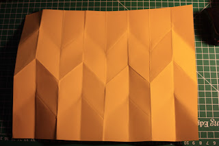
Unfolded
my first one, yay

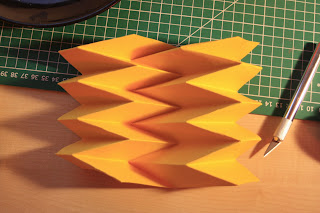
Orange and yellow looked good together

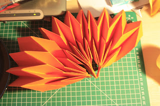
As I was making them, and when I finished one, as it is like a spring, I held one end and the other sprung open, it looked kind of like a spiky flower petal

Three put together
I also found out that if you put the two end tabs together then it could looks completely different, that's what I like about this module, a simple material can be turned into so many different things, it's amazing.


A bunch I put together, thought it looked pretty awesome


3D Origami


Continuing my research, this booked popped up a few times when looking for architectural paper sculptures, the front of the book was pretty eye catching so I decided to give it a read. My first thoughts after seeing some examples were 'Woah, I really want to make something' but as I looked on, it seemed alot harder than I thought :( 


I was set on having a go, so made a few triangles to get me started and i made enough to make a few basic shapes, but they just wouldn't stay together, I don't know if it was the paper I was using or a wrong technique, but I just didn't have the patience for this. Although, I'm definitely going to come back to this book in the summer when I have some free time as some of the creations in this book looks really interesting.


Some triangles I had left over


Research 3


This time, I decided to look into other forms of research for this project

In my last workshop I was given advice to look into Biology and Coral, also Buildings to get some inspiration and ideas 
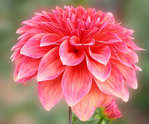

Dahlia flower
Flowers


When I have been experimenting with paper, I sometimes made petal like shapes and this made me want to research more into flowers, and the formation of different types of plants and also how the petals connect with one another so well.


What I like about the Dahlia flower above is the large spiky petals that grow out from the inside and also the size of the petals when it is fully grown. 

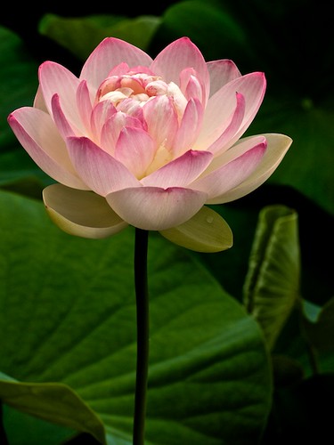
If I had to choose, lotus flowers would definitely be my favourite
flower. I like how the petals fold upwards instead of droop down, and
also the pattern that the petals form. 


White Lotus flower
Lotus flower


Architecture


I love modern, unusual buildings. I think Architecture is one of the best ways of portraying art, they can become so iconic. My favourite building has to be
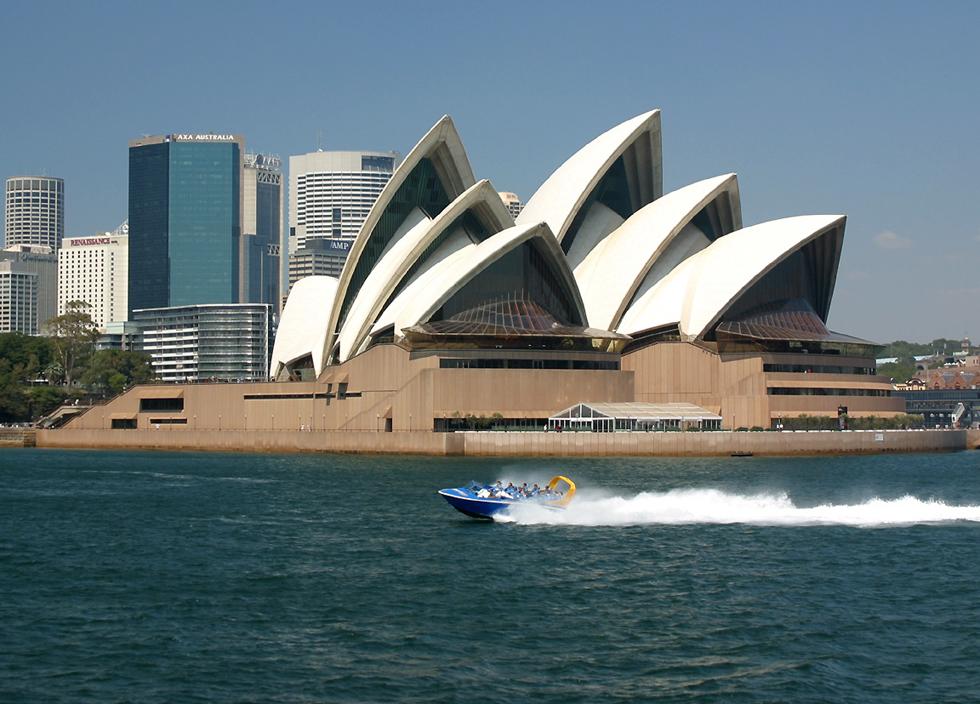
Sydney Opera House - Australia

I must visit this place one day, the use of curves and sharp edges makes it really stand out from the crowd. It sort of looks like insect wings? Many speculations say it is intended to represent sails on a ship.
The design of the segments of the roof could be made quite easily with paper.


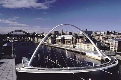
Clyde Arc bridge in Glasgow
Clyde Arc Bridge - Glasgow


Another modern piece of architecture, I like how the beams connect in a twisted pattern, which could be easily portrayed using paper, and making small strips and then slotting them into the base with one single large strip as a structural piece.

Rotating building - Dubai


Tuesday, 1 March 2011

Research 2


Masahiro Chatani

Masahiro Chatani is the creator of the art called 'Origamic Architecture'

Often seen in children's books, where a person or a house would pop up out of the book, I didn't realise until now how complex the designs could be using the 'pop-up' technique. 


Pop-up building


Origamic architecture is all about planning, knowing where to fold, where to slice and cut, it can become extremely fragile and again, one little tear and it can ruin the whole popping up process.


Another example of Chatani


After experimenting myself with pop-up art, It came quite clear that it's so confusing! Trying to work out which bit is going to pop up, and where to fold it can be a brain teaser. When browsing through both complicated and simple versions of pop-up, I liked the illusion that stairs gave when they were popped up.


My attempt at pop-up stairs


From the other side, also playing with shadow
Different sizes etc.


Sunday, 20 February 2011

Second Workshop

After researching a few artists I was still unsure on what I wanted to make or what technique I wanted to carry on further, so I used this workshop to try out another technique.

Cutting a piece into small strips then manipulating into different images

I find the hardest of this project, is the daunting fact of just having a blank piece of paper, that you can turn into anything with a scalpel and some glue. Also, looking over and seeing what Richard has produced in minimal time also makes you question your own work as it's just so good. 

Here are a few manipulations of what I made using the above technique

Kind of looks like a lampshade?

Wings?

Cutting and Folding


Reminds me of Syndey Opera house for some reason


Circular pattern


Experimenting more with Circular pattern