So, I finally came across something I like the look of, I first saw a similar technique in one of Richards pictures I found on the internet.
 |
| If only mine could look that good.. |
What I liked about this technique so much, is that it was all to do with folding, and how one sheet of paper can have so many folds and take many different shapes.
The whole design of this style of pleating, is based on triangles, you make triangles on the page and then fold them in on themselves, or out, and although it sounds pretty easy. I had a fair bit of trouble the first few times...
This was my first attempt, with just 1 fold, down the middle, simple enough really, kinda looks like a bridge the other way.
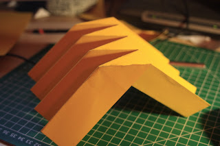 |
Bridge like?
|
The hard part was trying to keep that, while have 2 more folds to put into the mix, the first one I did took me a good hour to get my head round it, it's just so confusing, which way to fold it, make sure not to rip it, or make other creases and foldlines, a true nightmare!
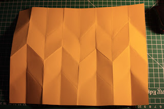 |
| Unfolded |
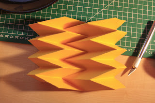 |
my first one, yay
|
 |
| Orange and yellow looked good together |
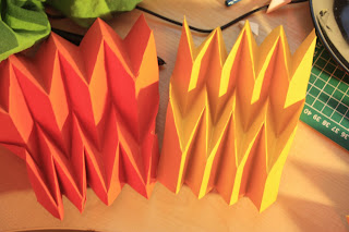
As I was making them, and when I finished one, as it is like a spring, I held one end and the other sprung open, it looked kind of like a spiky flower petal
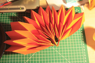 |
| Three put together |
I also found out that if you put the two end tabs together then it could looks completely different, that's what I like about this module, a simple material can be turned into so many different things, it's amazing.
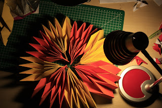 |
| A bunch I put together, thought it looked pretty awesome |


